Nine-pocket binder page layout ideas for collectors
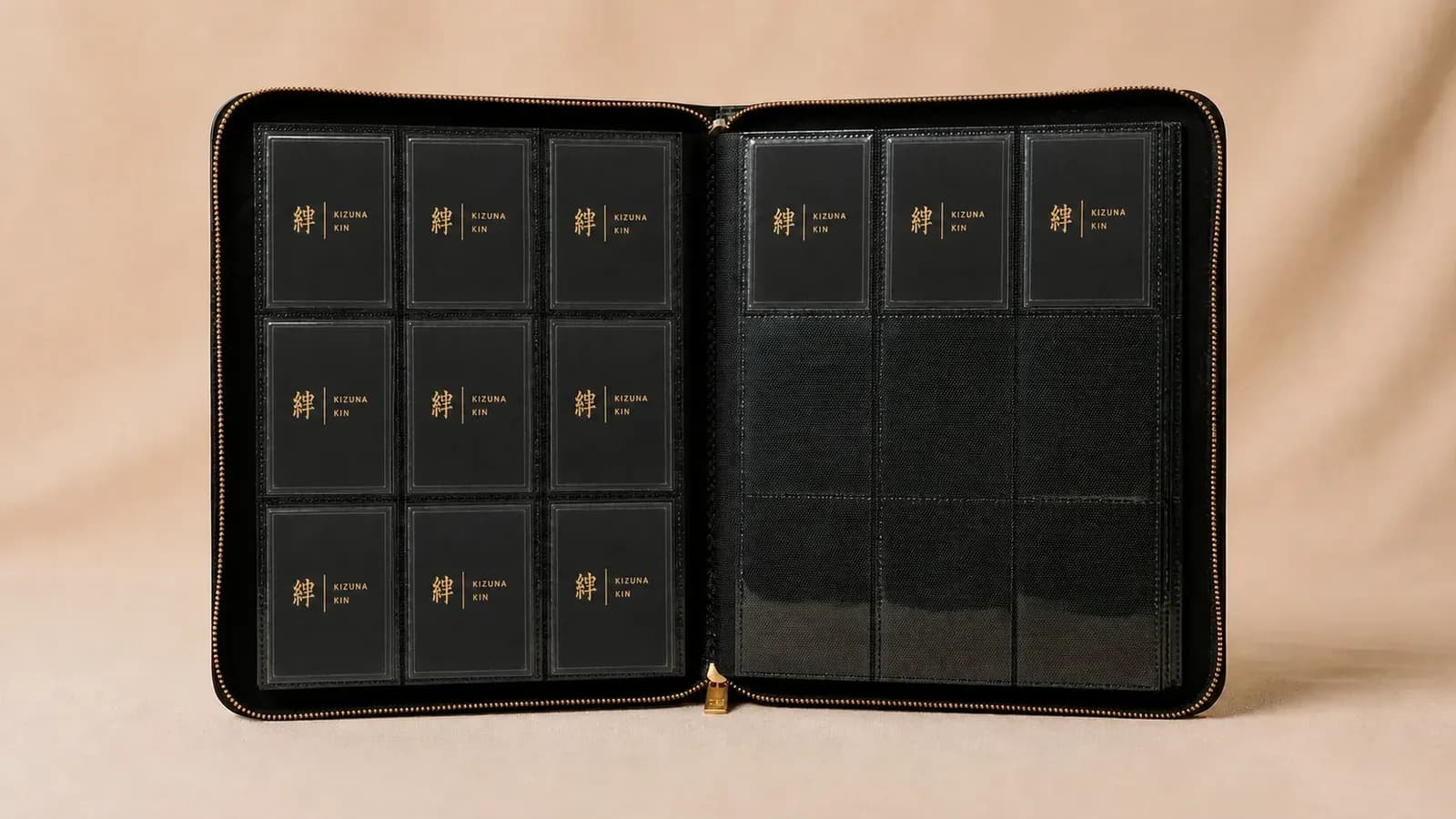
A nine-pocket page is more than nine storage spaces. It is a small composition. The position of each card changes what you notice first, which cards feel connected, and whether turning the page feels like following a collection or scanning a box.
There is no single correct layout. A numbered master set needs a different rhythm from a character collection, an artist page, or a group of cards chosen mainly because they look good together. The strongest binder has a clear reason for its order and enough flexibility to keep growing.
Begin with the purpose of the binder
Before arranging an individual page, decide what the binder is meant to do. Is it a complete set reference, a personal gallery, a player or character archive, or a record of collecting over time?
One binder can contain more than one idea, but each section should have a readable rule. If the first half follows card numbers and the second half follows favourite artwork, use a divider card or deliberate blank spread to show that the logic has changed.
The numbered set layout
For a master set, the simplest layout is usually the best: read left to right, then top to bottom, following the printed card numbers. This makes gaps obvious and reduces the chance that new pulls trigger a full reorganization.
Plan the entire set before inserting cards. Include secret rares, parallel versions, promos, or checklist cards only if they are part of your definition of complete. If the set does not divide neatly by nine, decide whether the next section begins immediately or on a fresh page.
Our master-set binder planning guide includes a capacity method for mapping the collection before filling pockets.
The character or player progression
Use a page to show how one subject changes across sets, seasons, teams, forms, or stages of a story. The top row can establish the earliest or simplest cards, the middle row can hold the main period, and the bottom row can finish with later, rarer, or more visually dramatic versions.
Chronology is not compulsory. A visual progression can work just as well: quiet artwork at the top, movement in the middle, and the strongest image at the bottom. What matters is that the sequence feels intentional when the page is viewed as a whole.
The illustrator or artist page
Cards by one illustrator often share line quality, colour decisions, or a way of framing the subject even when they come from different sets. A nine-card artist page makes those connections visible.
If you do not have nine cards, avoid filling the page with unrelated substitutes just to remove empty pockets. Five or six well-chosen cards can look more complete than nine cards with no visual relationship. Place the strongest work in the centre or use a balanced diagonal through the grid.
The colour progression
Arrange the page like a palette. Move from light to dark, warm to cool, or one dominant colour into another. A simple route is left to right across each row, but a diagonal gradient can make the eye travel through the entire page.
Look at the whole card rather than the border alone. Background, character, uniform, foil, and negative space all contribute to the colour weight. Sleeve colour also changes the result, which is one reason a consistent clear sleeve is helpful for binder displays.
The centrepiece layout
The centre pocket naturally receives attention. Put one favourite card there, then choose the surrounding eight cards to support it. They might share the same character, evolution line, team, element, artist, set, or colour.
This layout works especially well when one important card would otherwise disappear inside a strict numerical order. It lets the binder say something about your taste, not only about what was printed next. That personal editing is part of what makes a trading card collection personal.
The three-row story
Treat each row as a chapter. The top row introduces the subject, the middle row develops it, and the bottom row resolves it. A sports page might move from rookie to prime seasons to a later career card. A game collection might move from a place, to characters associated with it, to a defining event.
The story does not need to be official. It only needs to make sense to you and remain understandable when you return to the binder months later.
Mirrored facing pages
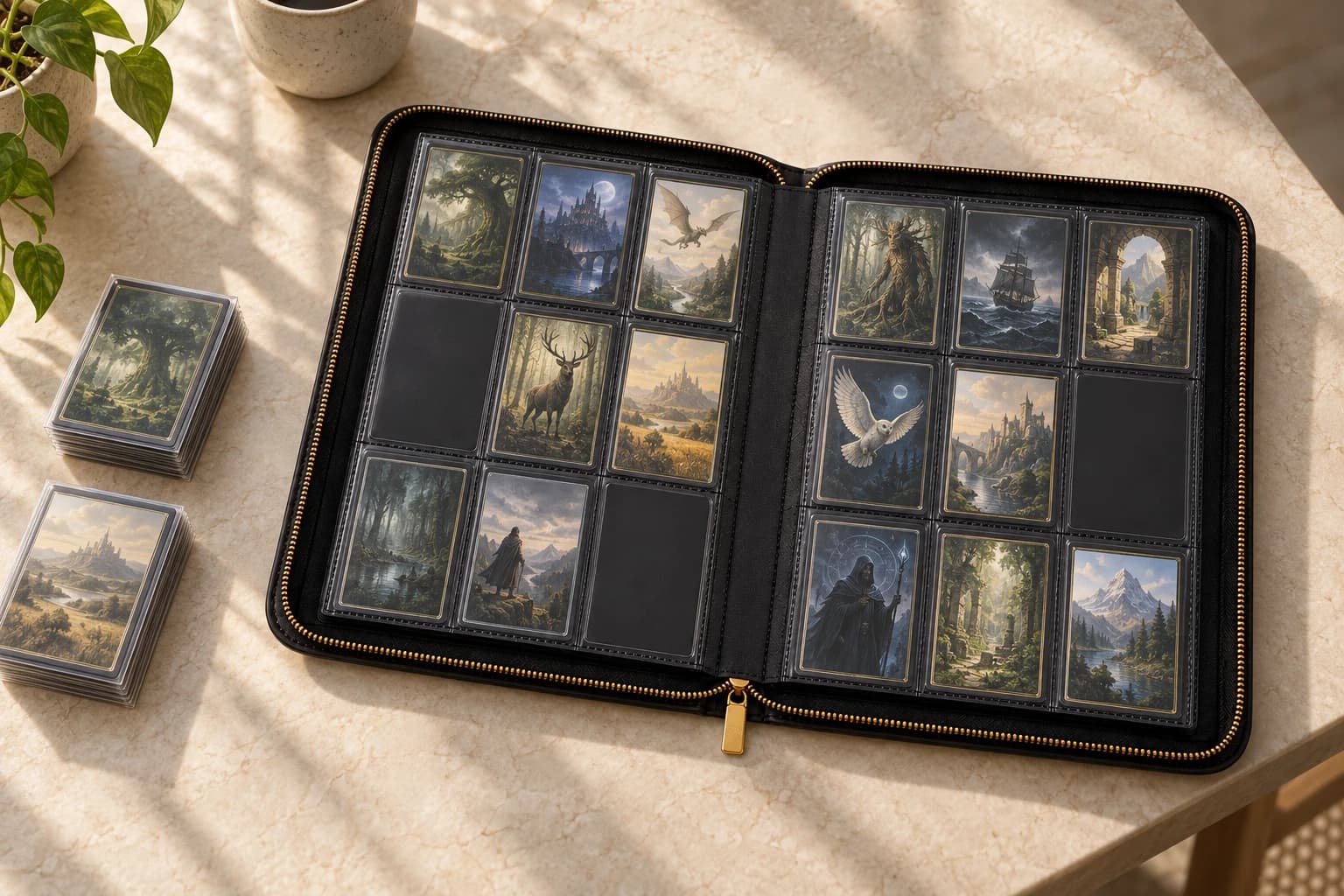
A single page is a 3-by-3 grid, but an open binder gives you an 18-card spread. Use the left and right pages as a pair: rivals, before and after, two teams, two colour families, base cards and parallels, or original artwork and later interpretations.
Mirroring positions creates a clear relationship. A card in the upper-left of one page can answer the card in the upper-right of the facing page. The centre pockets can hold the two anchors. This works best when both pages carry similar visual weight; one densely foiled page beside a quiet page may feel accidental unless contrast is the point.
Intentional empty pockets
An empty pocket can reserve a known gap, separate two ideas, or give a special card more space. It should look deliberate. A symmetrical gap, a complete empty row, or a clearly reserved numbered position reads better than random holes scattered through the page.
Never stretch a collection merely to fill nine spaces. If the group is complete at seven cards, build the page around seven. A binder is allowed to show that the collection is still in progress.
Test the layout before inserting cards
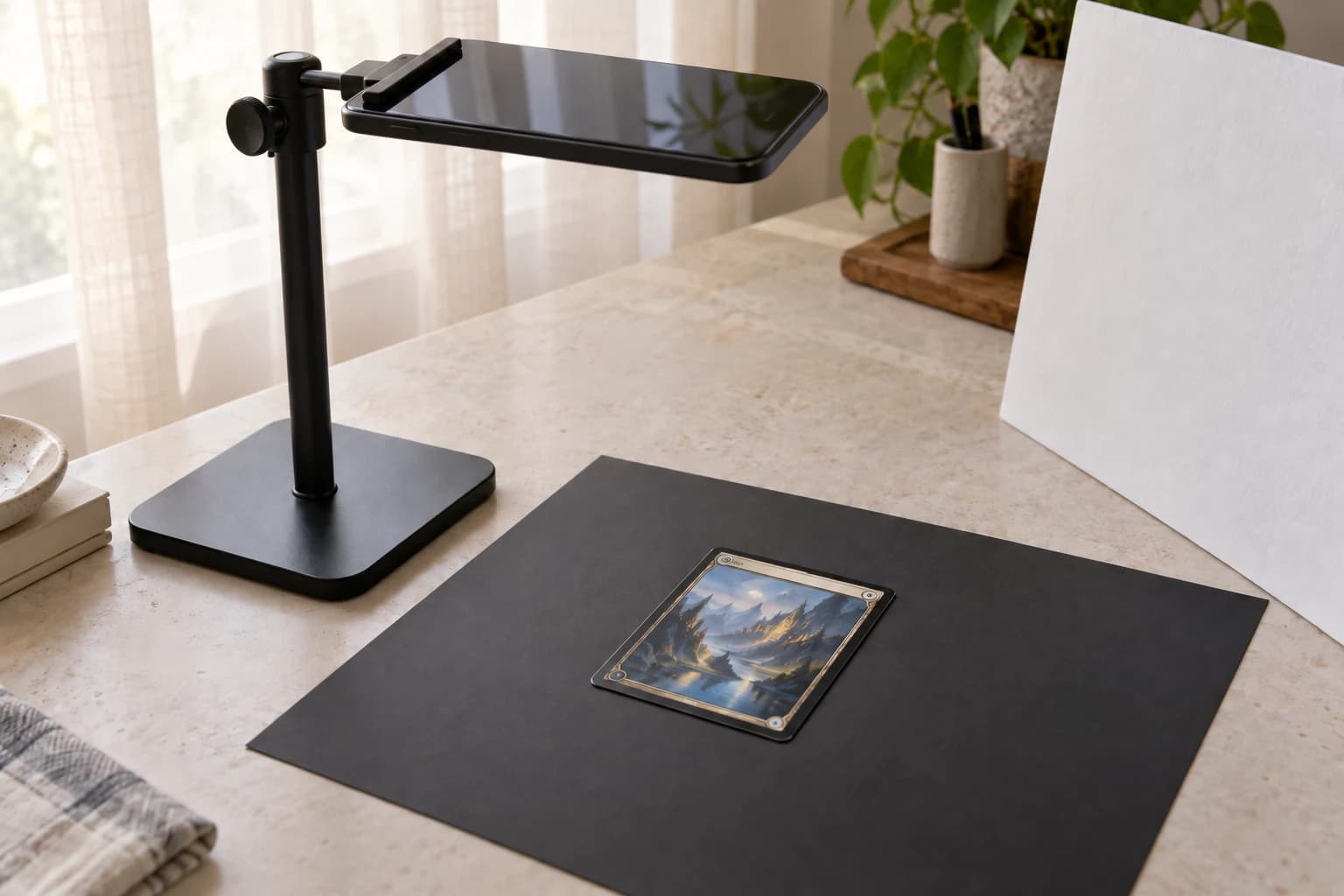
Lay sleeved cards on top of the closed page or on a clean table in a 3-by-3 grid. Photograph two or three options with your phone. It is easier to compare arrangements in pictures than while repeatedly moving cards in and out of pockets.
Once the order feels right, insert the cards with the binder flat and the page fully supported. The sleeve and card should enter without catching or bowing. For the practical side of page loading, see how to store a card collection in a binder.
Keep one rule consistent
Creative layouts still benefit from consistency. Choose at least one element that carries through the binder: the reading direction, how empty spaces are used, where centrepiece cards sit, how sections begin, or which sleeve type is used.
That repeated rule makes very different pages feel like one collection. The result can be useful and expressive at the same time: easy to browse, easy to maintain, and unmistakably yours.